Everyone and their mom is using Linktree nowadays. I've used it for a long time myself, since it seemed like the trendy thing to do: having a list of links in your Twitter and Instagram bios to refer folks to the other platforms that you're active on.
What always bothered me about it though, was that further styling options were locked behind a paywall.
To be frank, I never thought that it was worth the couple of bucks just to get a flashy list of links, so I never did. Although their analytics did show that I would get some clicks on occasion. Ultimately, you're left with a very bland list of links.
I don't know why it took me so long to try and make my own, but I finally did! And it was easier than expected!
CSS isn't really that complicated; you just need a handful of tricks to make this list happen and make it flashy. While we're at it we'll also make it responsive, and get it up and running for free via Github pages.
Let's get started! Here's a video of what we'll make:
Goodbye linktree 👋 made my own!
— Ahmad Moussa || Gorilla Sun (@gorillasu) April 28, 2023
Would there be interest if I wrote about how to make a little list like this + hosting it on github pages? pic.twitter.com/7nDIXc9gnC
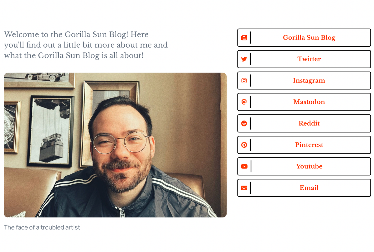
Alternatively you can also check out the about page of this site to see the final product in action!
The only requirement here is basic knowledge of HTML and CSS, the explanations I'll provide! You can basically regard this post as a mini CSS lesson.
HTML and CSS Skeleton
Let's get a really simple webpage going. The HTML code that we'll start with:
<!DOCTYPE html>
<html lang="en" dir="ltr">
<head>
<meta charset="utf-8">
<link type="text/css" rel="stylesheet" href="style.css" />
</head>
<body>
<div class="flex-container">
<div class="about">
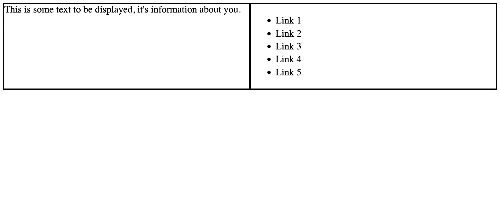
This is some text to be displayed, it's information about you.
</div>
<div class="link-list">
This is where the list will be.
</div>
</div>
</body>
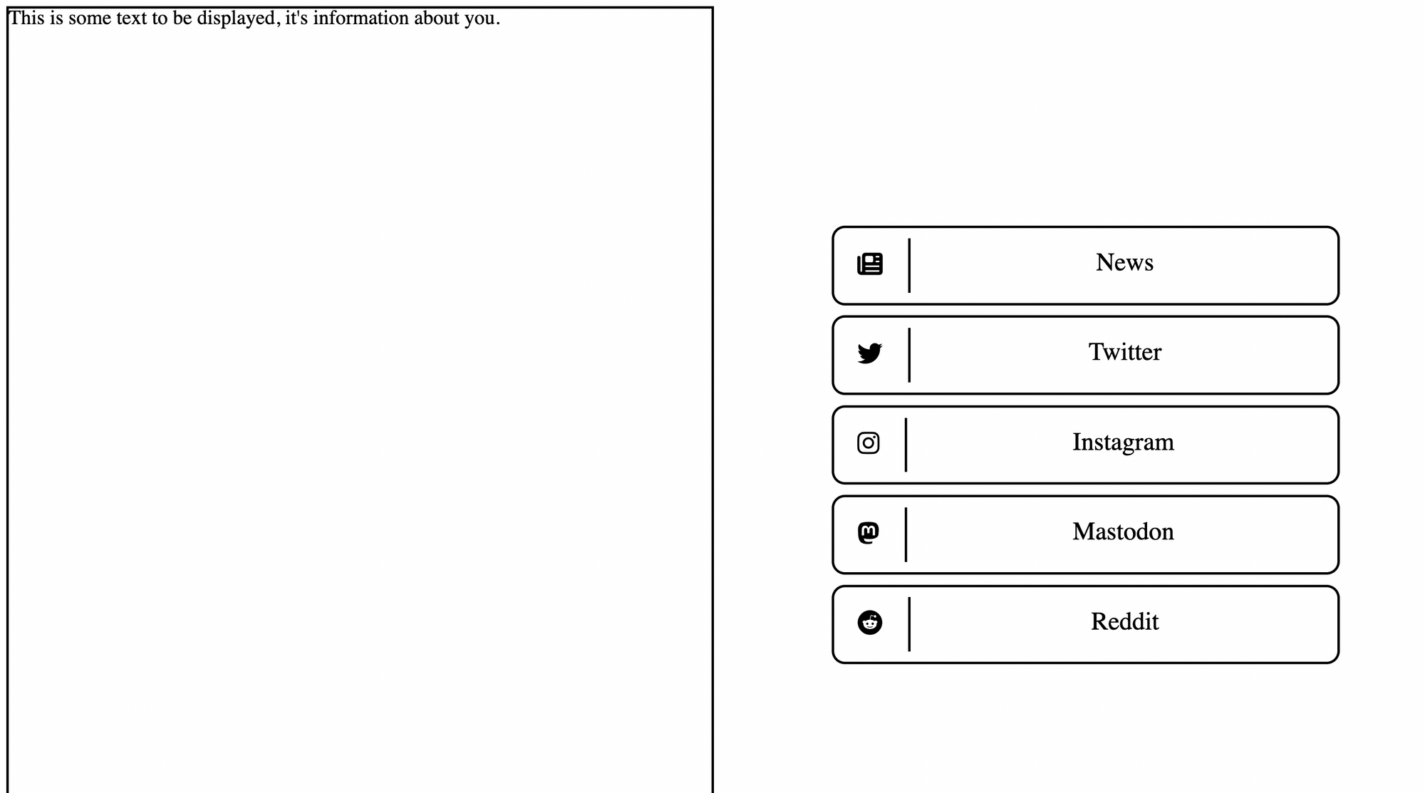
</html>Not much to see here yet, except for a couple of nested divs in the body tag. We can go ahead and already assign class names to each one of them to indicate their function.
We're essentially creating a flex box container that will hold the elements of our page.
A flex box is a convenient CSS layout model that makes it easy to create responsive behaviour, as it will automtically handle how space is distributed among it's children elements.


Inside this flex box, one of the divs will be an about section, where we'll present information about ourselves, and the other one will contain the actual list of links.
We've preliminarily put some text into our divs to better see how these flex boxes are behaving. We can now create the CSS that makes this happen:
.flex-container {
  display: flex;
  flex-direction: row;
}

.about {
  flex: 1;
  border: 2px solid black;
}

.link-list {
  flex: 1;
  border: 2px solid black;
}
In the flex-container class:
display: flexsimply tells the browser that this div is a flex-boxflex-direction: rowsignals that we want the items inside our flex box to be aligned side by side. This is actually already the default value, but it never hurts to be explicit about these things.
As for the two divs:
flex: 1;the flex property is actually a shorthand that controls several values. In this case we are simply telling the browser that this flex item should take up as much space as possible and shrink/grow proportionally to the window size.border: 2px solid black;simply adds a black border to the div. This is just a simple trick used for debugging purposes so that we can see what's going on.
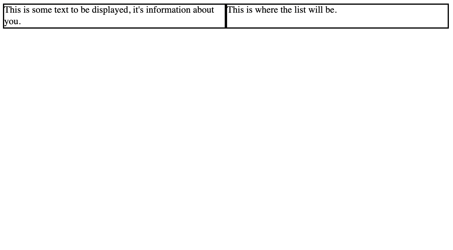
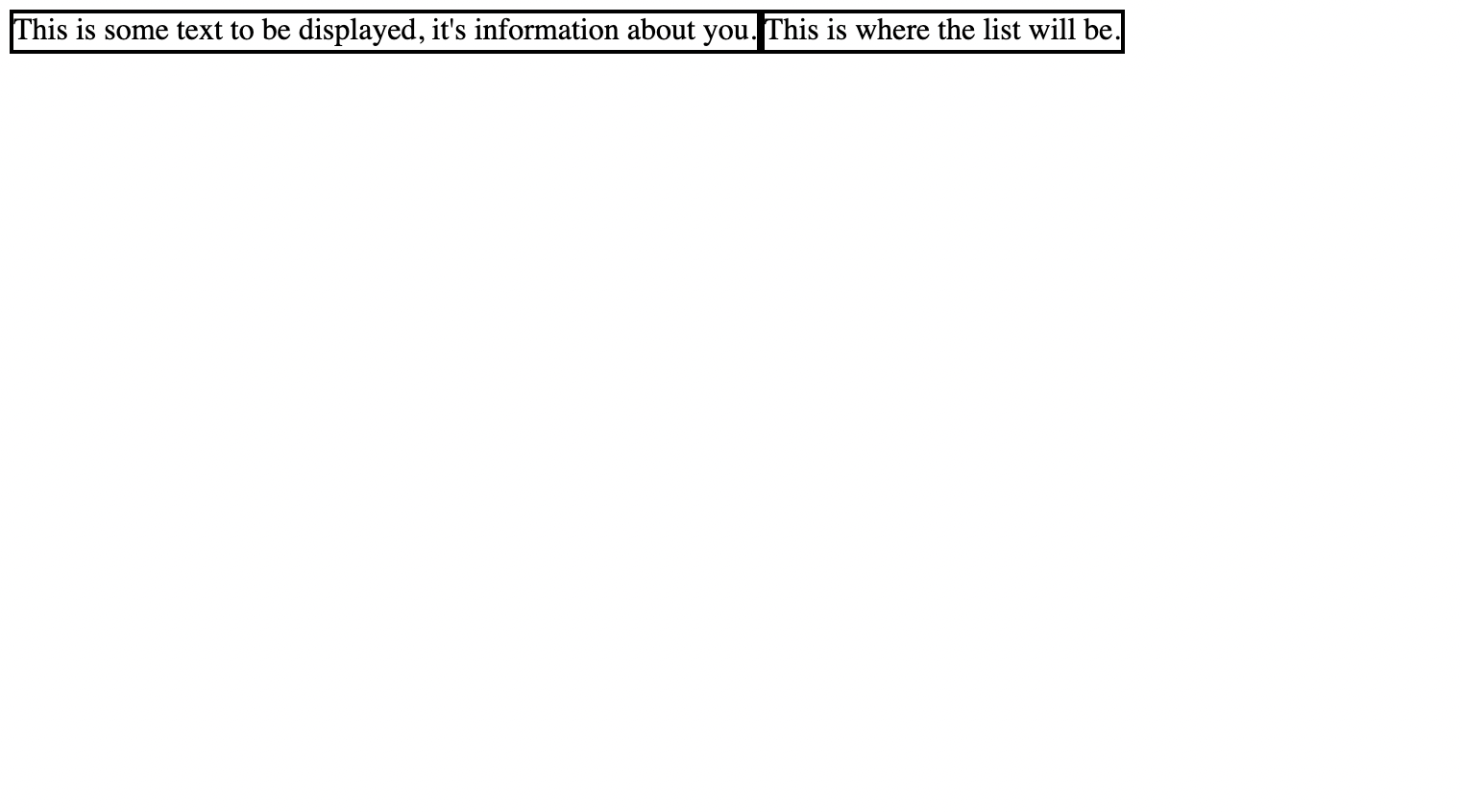
If we run this, we'll end up with a very simple webpage at this point, on the right you can see what it would look like without the flex attribute added to our two divs:
Responsive behavior via CSS Media Queries
Now what we would like to happen, is that one of the two flex items should go on top of the other one when the window goes below a certain width (when the window becomes tall/narrow).
We don't actually need any complicated Javascript for this, there's a really cool CSS trick called media queries:
A media query that checks if the window width has become less than a certain value would look as follows:
@media only screen and (max-width: 600px) {
  /* whatever you want to happen in this case goes here */
}
In our case we want the list of links to go on top of the about section, or maybe even have the about section disappear completely when viewed on a mobile device. We can achieve this with the following lines of code:
@media only screen and (max-width: 600px) {
  .flex-container {
    flex-direction: column-reverse;
  }
}
When the window's width goes below 600 pixels the media query will set the flex-direction of the flex-container to column-reverse, essentially stacking the div with the list of links, on top of the about section (right to left basically).
It also automatically switches back to a row direction when the screen becomes large than 600 pixels again. Here's what this looks like in action:
Styling the List
Now we can work on styling our list. I simply tried to emulate a similar design to what linktree is doing:
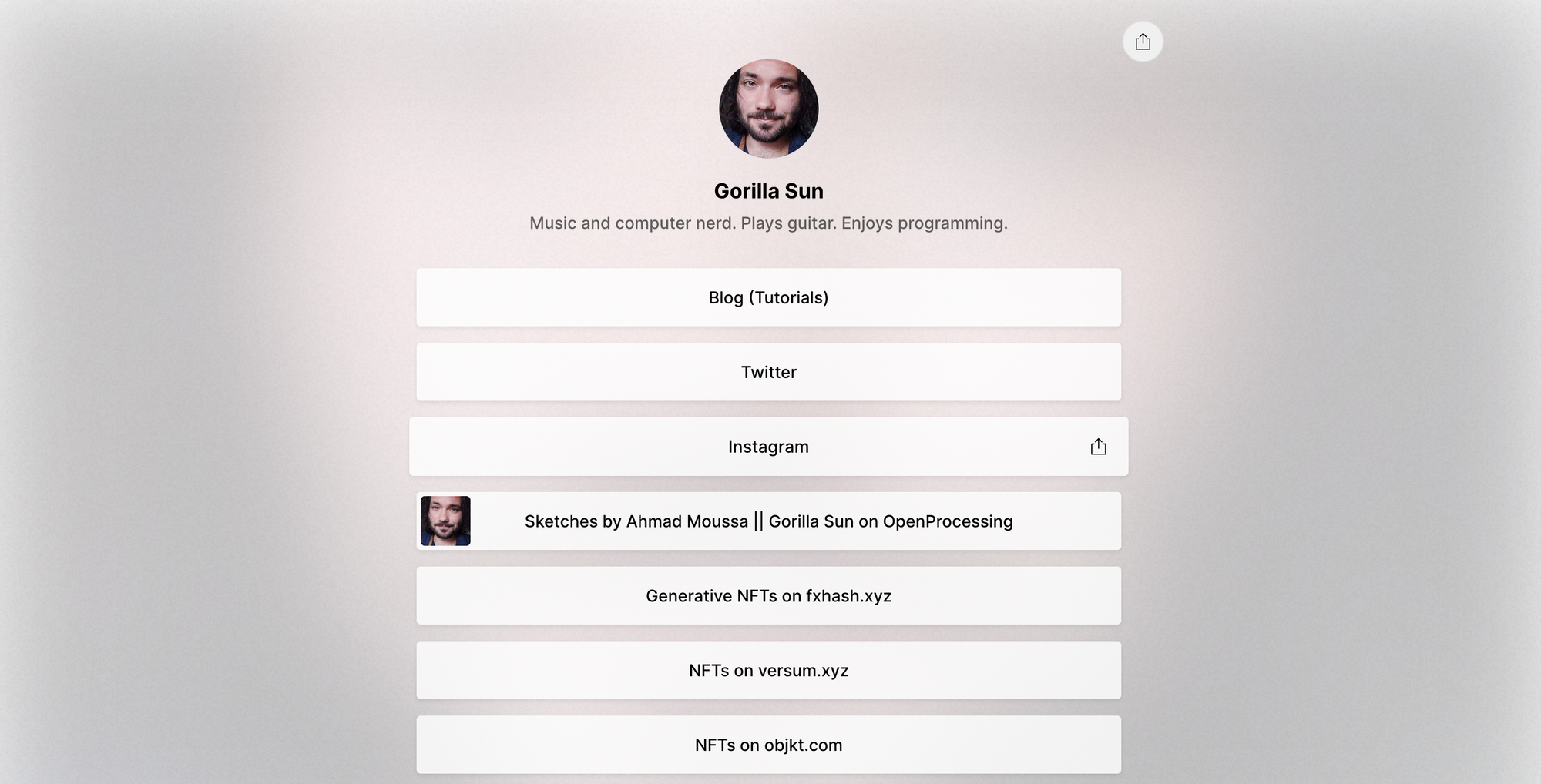
What I especially liked was the little thumb in the Openprocessing entry, I wanted something like that but for all of the links. We'll get to that in just a second, but let's first create and populate our list in HTML.
<div class="link-list">
    <ul class='styled-list'>
        <li class='list-item'>Link 1</li>
        <li class='list-item'>Link 2</li>
        <li class='list-item'>Link 3</li>
        <li class='list-item'>Link 4</li>
        <li class='list-item'>Link 5</li>
    </ul>
</div>
Again, the classes we added here don't exist yet, so there will be no visual impact. We simply get something that looks like this:
The style:
.link-list {
  flex: 1;
  border: 2px solid black;
  padding: 1em;
}

.styled-list {
  list-style: none;
  list-style-type: none;
  padding: 0;
  margin: 0 auto;
}

.list-item {
  border: 2px solid black;
  margin: .5em 0;
  text-align: center;
}
Don't worry about trying to follow along with the code, I'll include a complete example at the very end. For now just try to understand what all of the CSS attributes do. Let's see what we did here:
- We created two new classes
styled-listandlist-item, corresponding to the two classes that we added for theul(unordered list) andli(list item) tags in the HTML respectively. list-style-typeandlist-styleboth do the same thing, they simply remove the little dot that preceeds the list items. We also set thepaddingto 0, otherwise we'd be left with a list that has an indent on the left side.- To center the list inside of the containing div we can use
margin: 0 auto;which sets the top and bottom vertical margin of the list to 0, and centers the element horizontally on the page as the margins will be equal on both sides with respect to the containing div. - As for the individual list items we'll also add a border, and give them margins on the top and bottom to space them out a bit. We also want the text inside of them to be centered which can be achieved with the
text-alignattribute. - As for the div that contains the list itself we want to give it a little bit of padding so that the list items don't touch the outer border.
With all of this in place we'd end up with a list that would look as follows:
Alright, we're already getting closer!
Styling the List Items
We'll continue styling the list, and now add icons to our links.
For this, we'll have to split our list items into two parts, one that will hold the icon and another that will display the link text. For this we need to create two new divs in each list entry, the HTML will look like this:
<ul class='styled-list'>
    <li class='list-item'>
        <div class='link-list-logo'>Icon</div>
        <div class='link-list-text'>Link Text</div>
    </li>

    /* more list tags here */

    <li class='list-item'>
        <div class='link-list-logo'>Icon</div>
        <div class='link-list-text'>Link Text</div>
    </li>
</ul>
We'll also apply classes to these two divs to be able to style them. Now the trick here is to make each list entry a mini flex box, where we align the icon on the right side, and make the text take up the remainder of the space. We'd end up with CSS that would look as follows:
.list-item {
  /* from before */
  border: 2px solid black;
  margin: .5em 0;

  text-align: center; /* don't need this anymore */

  display: flex;
  flex-direction: row;
  padding: .5em;
}

.link-list-icon {
  flex: 0 1;
  border: 2px solid black;
  padding: .5em;
  margin-right: .5em;
}

.link-list-text {
  flex: 1 0;
  display: flex;
  justify-content: center;
  border: 2px solid black;
  padding: .5em;
}- The list-item class becomes a flexbox with row direction.
- The link-list-icon becomes a flex item that is allowed to shrink but not grow. In this manner it will sit at the left side of the list.
- The link-list-text becomes a flex item that is allowed to grow but not shrink. In this manner it will take up the remaining horizontal space. We also make it a flex box and use the justify-content attribute to center the text (we could also do this with the text-align attribute though)
- We add paddings and margins to make it look nice.
Adding List Icons
To add the cute little icons we'll use fontawesome. Here you can either download the individual icons that you need or create an account and make a kit.
The latter is what I did, and allows us to simply drop a script tag in our page's head to get access to the icons.
<script src="https://kit.fontawesome.com/[your number identifier here].js" crossorigin="anonymous"></script>Then we can simply add icons directly in the HTML like this:
<div class='link-list-logo'>
	<i class="fa-solid fa-newspaper"></i>
</div>
In the fontawesome explorer you can simply search through the free icons that are available. Our list looks now as follows:
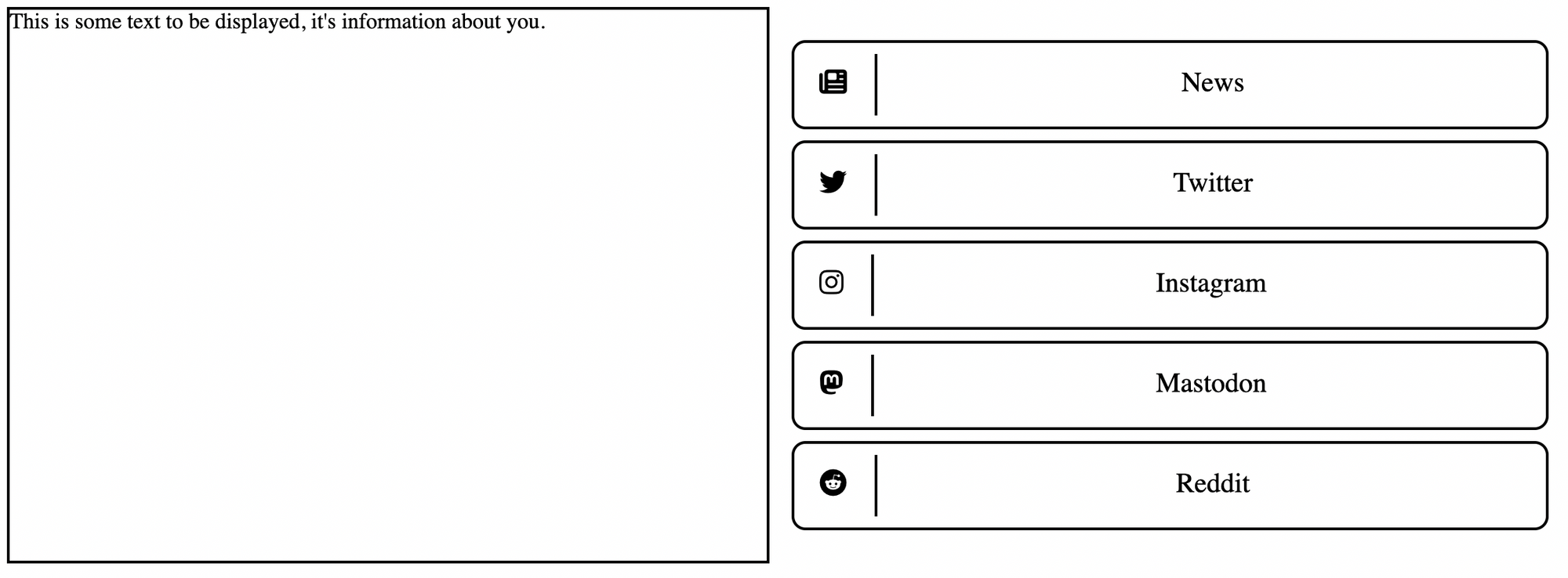
I also added some styling to make the list look nicer.
.list-item {
  border: 2px solid black;
  margin: .5em 0;
  text-align: center;

  display: flex;
  flex-direction: row;
  padding: .5em;

  border-radius: 10px;
}

.link-list-icon {
  flex: 0 1;

  padding: .5em 1em .5em .5em;
  margin-right: .5em;
  font-size: 20px;
  border-right: 2px solid black
}

.link-list-text {
  flex: 1 0;
  display: flex;
  justify-content: center;

  padding: .5em;
  font-size: 20px;
}
Also while we're at it, let's limit the width of the list and center it horizontally in it's parent:
.styled-list {
  list-style: none;
  list-style-type : none;
  padding: 0;

  max-width: 400px;
  margin: 0 auto;
}
Making the Links Clickable
We also need to make the links clickable and have them behave like buttons. For this we can wrap the list items with the anchor tag <a>:
<a href='https://www.gorillasun.de'>
    <li class='list-item'>
        <div class='link-list-icon'><i class="fa-solid fa-newspaper"></i></div>
        <div class='link-list-text'>Blog</div>
    </li>
</a>
And we obtain clickable list entries:
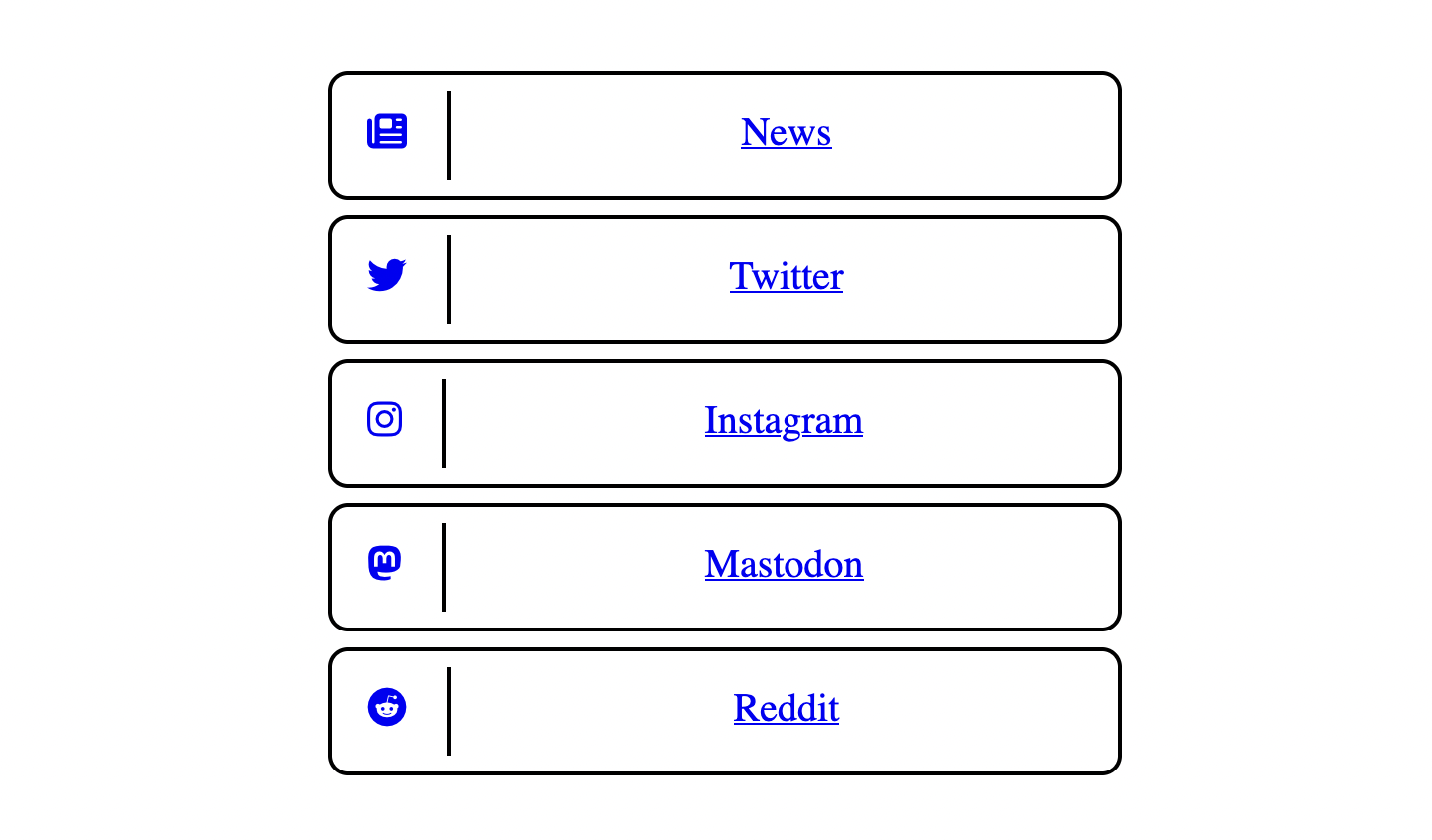
We also want to remove the coloration and the underline of these links, which can be done as follows:
.styled-list > a {
  text-decoration: none;
  color: black; /* or whatever color you want */
}
Making the List Sticky
When the window has a landscape aspect ratio and the content on the left is being scrolled, we want the list of links to remain on screen and not disappear upwards. There's two ways to do this.
Sticky to Top
The CSS ingredients for this particular behavior are:
.link-list {
  flex: 1;
  padding: 1em;

  position: -webkit-sticky; /* this is for Safari */
  position: sticky;
  top: 0;
  align-self: flex-start; /* necessary */
}
The combination of position: sticky; and align-self: flex-start; make it such that the list of links stays stuck to the top of the window even when the lefthand side is scrolled.
We can temporarily manually set the height of the about section to a large value, like 4000px for instance, and see what happens:
Sticky and Centered
There's a different way of making the flex item sticky if you want it to be centered vertically as well inside of it's flex item container.
This looks a bit cleaner imo, but the CSS for it is a bit gnarlier:
.link-list {
  flex: 1;
  padding: 1em;

  align-self: flex-start;
  position: sticky;
  top: 0;

  display: flex;
  height: 100vh;
  margin: 0 0;
  justify-content: center;
}

.styled-list {
  list-style: none;
  list-style-type : none;
  padding: 0;

  margin: auto 0;
  width: 100%;
  max-width: 400px;
}
Essentially, we're setting the link-list div that is wrapped around the actual list, to take up the entire vertical space of the window (the view port) with the attribute height: 100vh. Alongside position sticky; and align-self: flex-start; we can now vertically center the list inside of this div with justify-content: center; and margin: auto 0;
De-sticking the list with a media query
Now we also need to account for the sticky position attribute when the window becomes narrow and essentially disable it. We'll simply use another media query and set the position of the list to relative:
@media only screen and (max-width: 600px) {
  .link-list {
    position: relative;
  }
}
Now we'll get something that functions like this, also added some text for starters:
Other Stylistic Stuff
Text and Headings
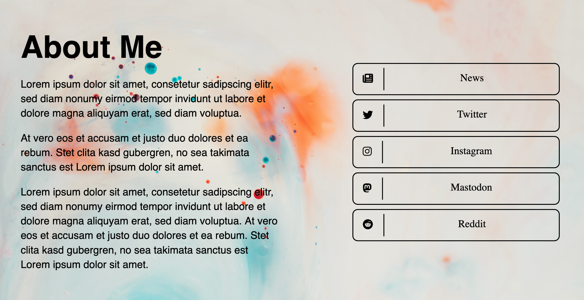
We can add some dummy text to the about section now, as well as a simple heading:
<div class="about">
    <h1>About Me</h1>
    <p>Lorem ipsum dolor sit amet, consetetur sadipscing elitr, sed diam nonumy eirmod tempor invidunt ut labore et dolore magna aliquyam erat, sed diam voluptua.</p>
    <p>At vero eos et accusam et justo duo dolores et ea rebum. Stet clita kasd gubergren, no sea takimata sanctus est Lorem ipsum dolor sit amet.</p>
    <p>Lorem ipsum dolor sit amet, consetetur sadipscing elitr, sed diam nonumy eirmod tempor invidunt ut labore et dolore magna aliquyam erat, sed diam voluptua. At vero eos et accusam et justo duo dolores et ea rebum. Stet clita kasd gubergren, no sea takimata sanctus est Lorem ipsum dolor sit amet.</p>
</div>
To style this we'll use a child combinator. The child combinator is represented by the larger than symbol, and in this case specifies, that the p and h1 tags that occur in divs with the about class should have a specific style applied:
.about > p {
  font-size: 20px;
  font-family: sans-serif;
  line-height: 28px;
}

.about > h1 {
  font-size: 60px;
  font-family: sans-serif;
  line-height: 70px;
}
Nothing fancy here, just a regular sans-serif font, cranking up the font-size to 20px (it's good practice to use a larger font-size, makes things more readable). Same thing for the heading!
Limiting the text width
One other thing that I'd like to do here is limiting the width of the about section; text doesn't look good and becomes much less readable when it becomes too wide. Similarly to earlier where we limited the width of the list, we can use the max-width attribute again:
.about {
  flex: 1;
  padding: 1em;
  max-width: 600px;
  margin: auto auto;
}
Also setting the margins to auto so that they sit nice and centered. And while we're at it, we'll also set the width of the entire flex-container, such that the text and list don't sit too far apart from each other:
.flex-container {
    display: flex;
    flex-direction: row;
    max-width: 1180px;
    margin: 0 auto;
}
Hover Animation
We can go a step further and also animate our links when someone hovers over them with the following CSS snippet:
.styled-list li {
  transition: ease .3s;
}

.styled-list li:hover {
  box-shadow: 4px 4px #FF8600;;
}
Background Image
We can also set a pretty background image very easily, we simply apply it directly to the body of the page:
body {
  padding: 0;
  margin: 0;
  background-image: url("background.jpg");
   background-repeat: no-repeat;
  background-size: cover;
}
Complete Code
You can find everything we covered in this Github repository and use it as a template to get started and make your own thing:
 AhmadMoussa
Hosting the List on Github Pages
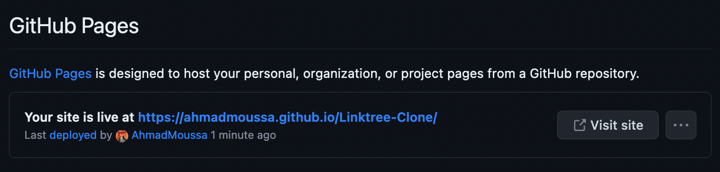
After uploading your files to a fresh github repo, you'll want to head over to Settings > Pages > Branch > Select Main and hit save. Then give it a couple of minutes and refresh the page.
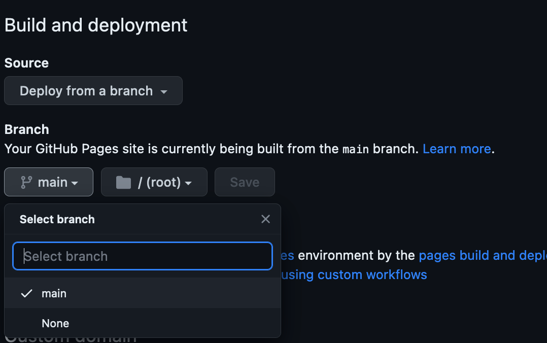
After a few, you should see a notification pop-up at the top of the page, clicking on the link you should now see that you link list is live.
Hope you enjoyed this post and that you'll use this as starting point to put together your own little linktree-like website! Happy coding, cheers, and check out some of my other posts!